RMA Property Investment Group
Brand Identity
Brand Identity
Logo Design
Brand Guidelines
Print Collateral
Brand Templates
Branded Environment
Signage
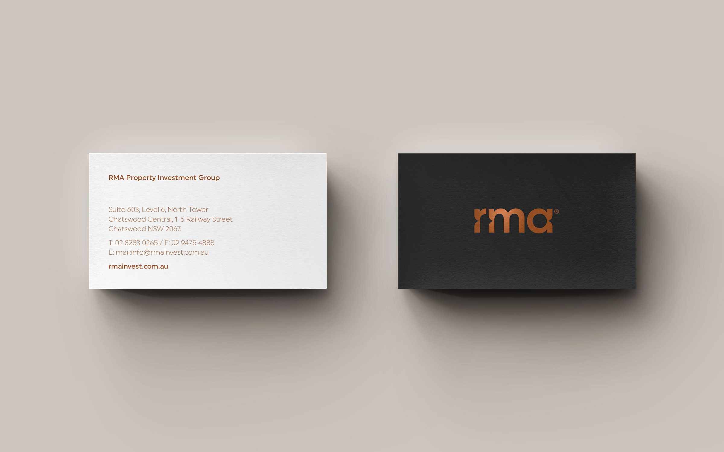
RMA Property Investment Group approached L+L Design to perform a complete overhaul of their brand identity. With the goal of establishing RMA as a high end, competitive property development company, we created a contemporary visual identity imbued with sophistication, elegance and refinement. This included a brandmark, colour palette and typography system designed as a flexible yet cohesive visual language, to position RMA as an attractive offering to potential development partners and buyers alike.
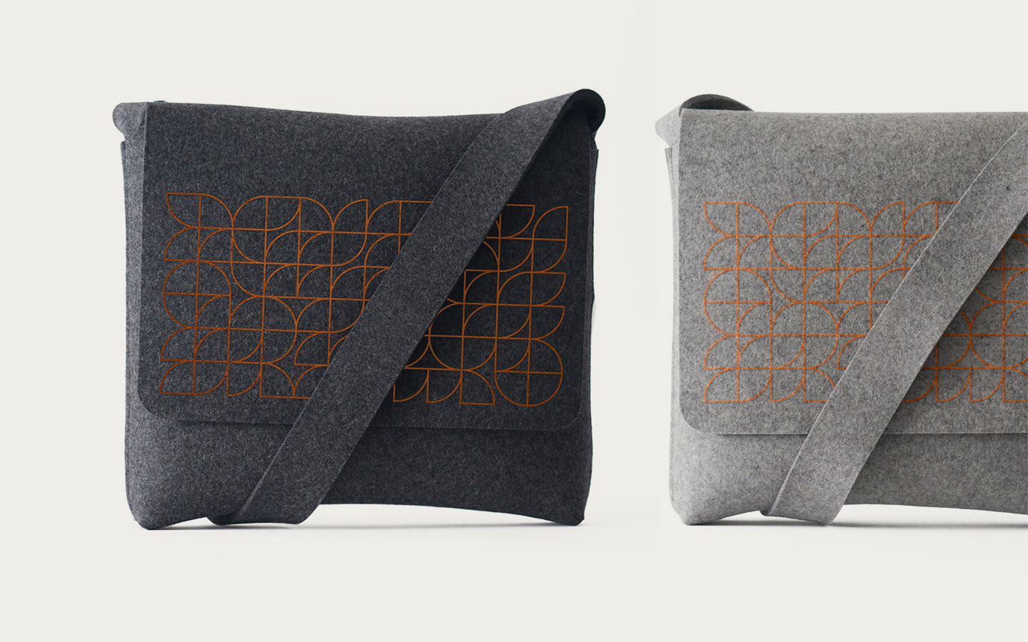
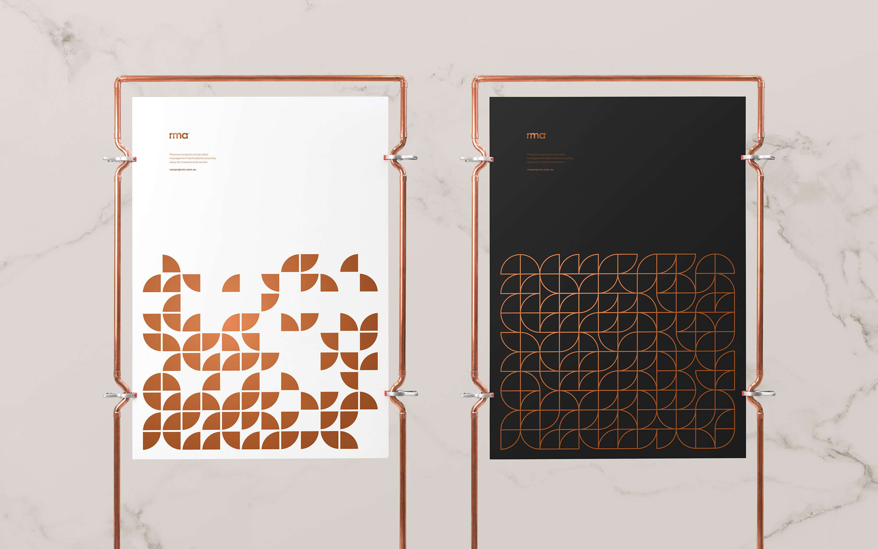
The brandmark is a bespoke, ‘engineered’ typographic arrangement, created to evoke a sense of the built environment. Sharp lines meet rounded corners in unique locations, referencing the kind of architectural detail found in premium property developments. The inspiration for these shapes is derived from the quarter-circle used to indicate open doors on blueprint floor plans. To further strengthen the RMA brand, and to present an impression of sophistication and quality, we chose a luxurious ‘copper’ primary brand colour.


