Shelston IP
Brand Refresh
Brand Refresh
Advertising
Print Collateral
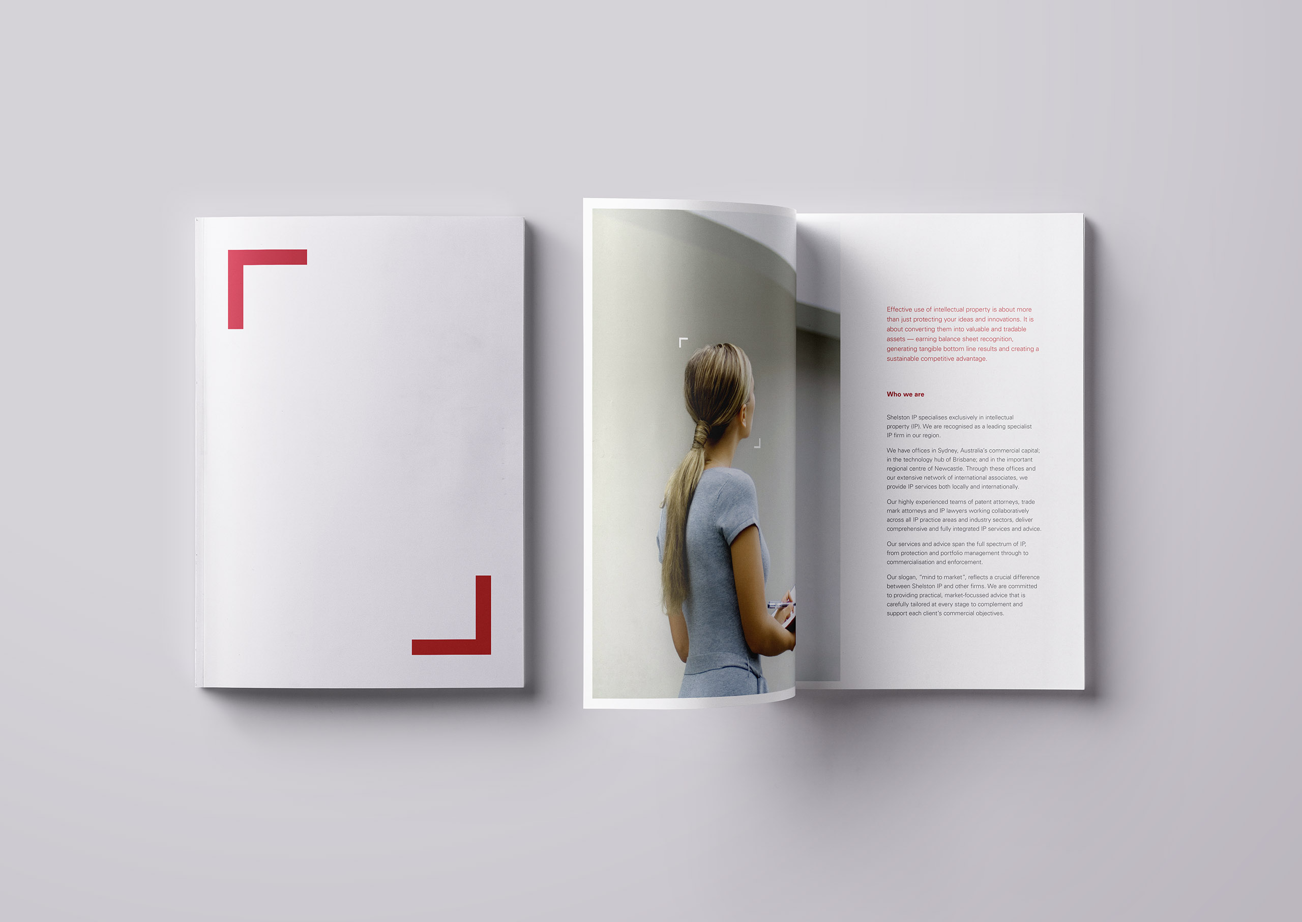
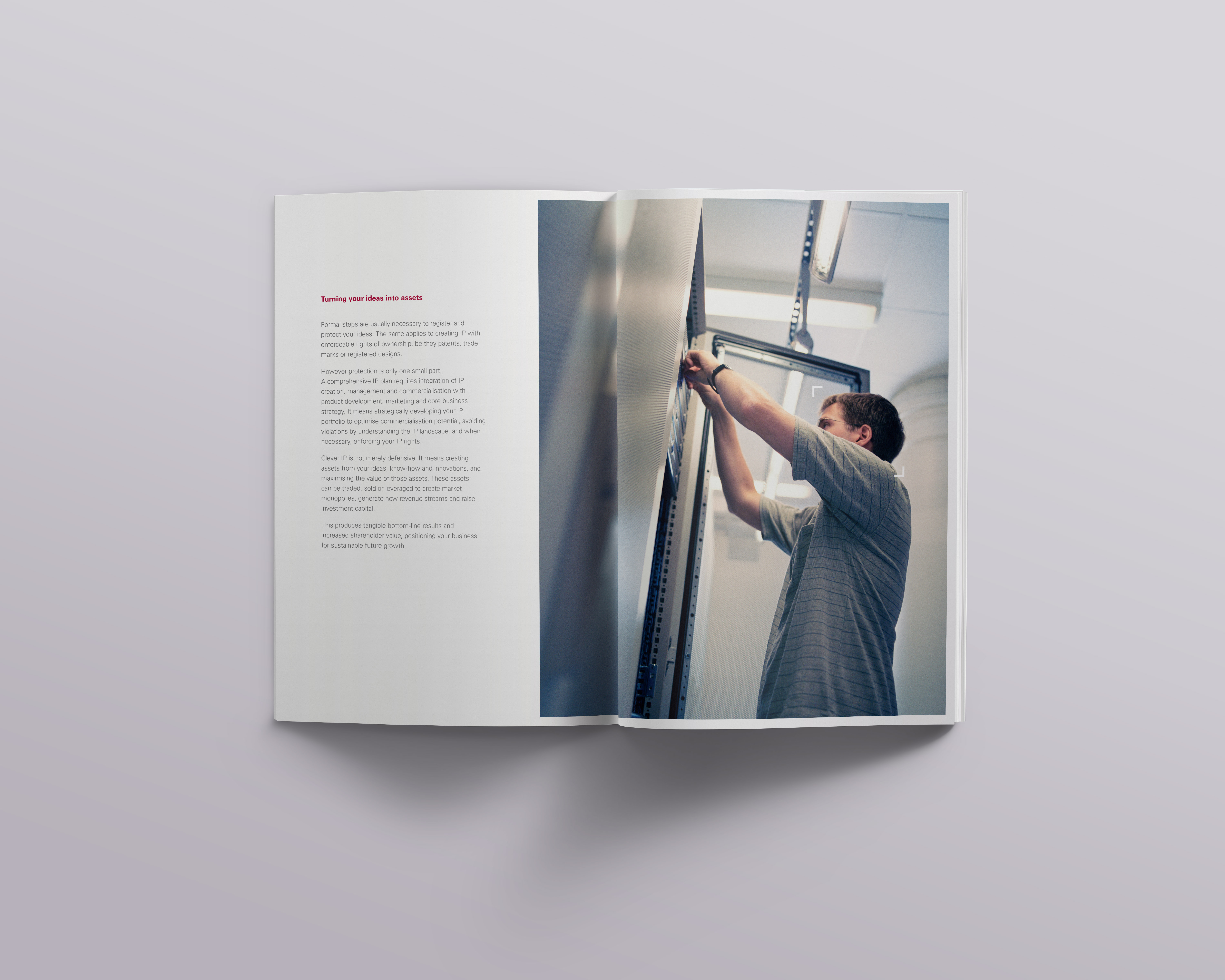
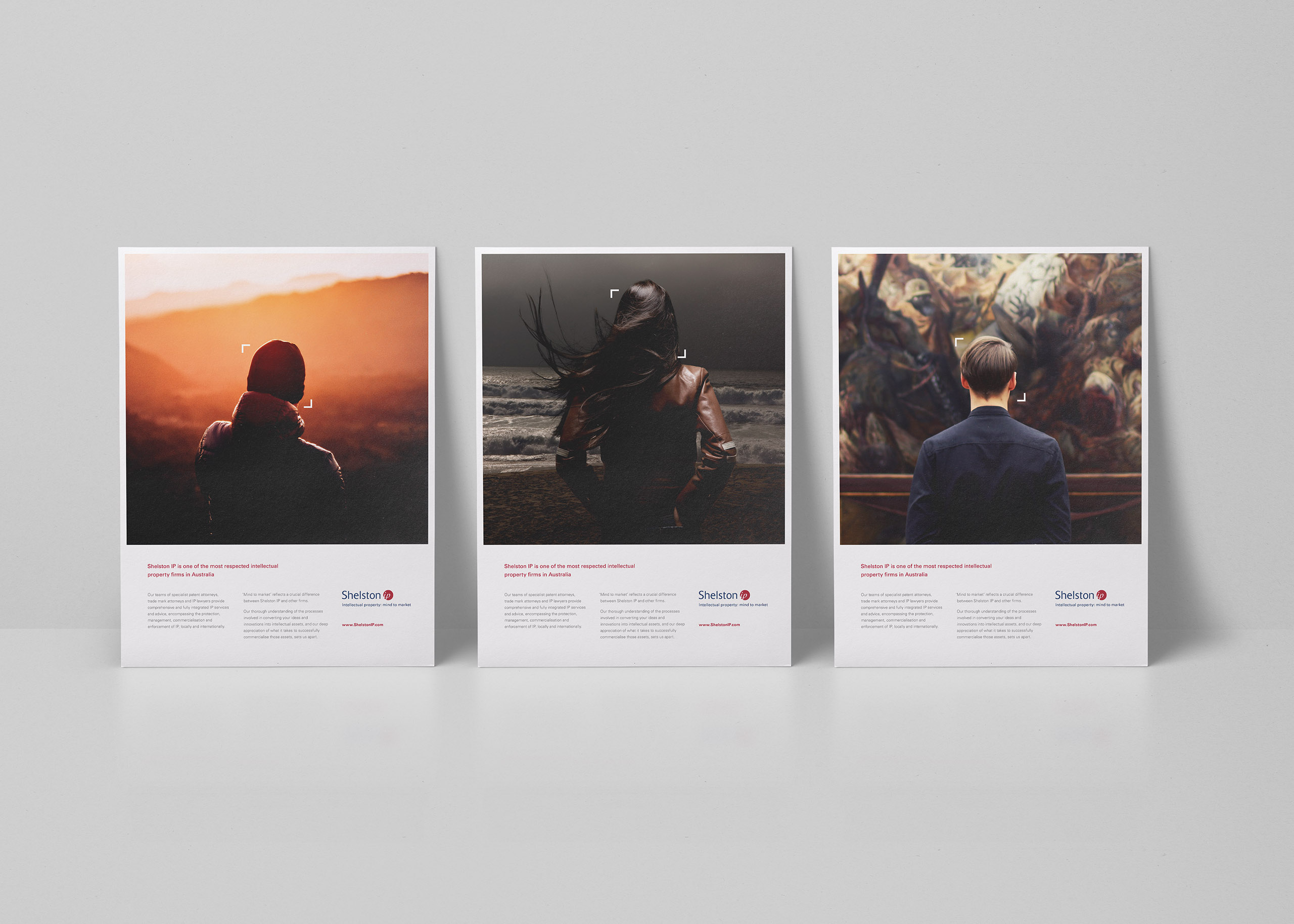
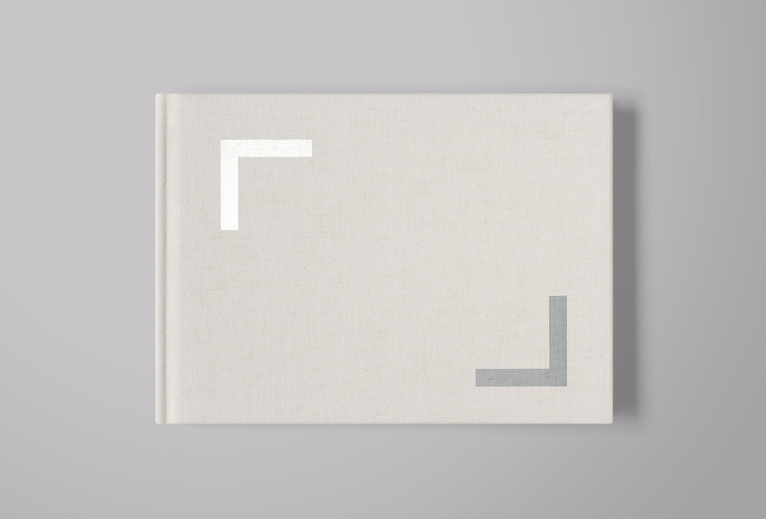
Established in 1859, Shelston IP is one of the oldest, largest and most respected specialist intellectual property firms in Australia. When we were approached to refresh their brand, we saw it as an exciting opportunity to collaborate with a client from an entirely different industry, but with a shared professional currency — ideas. To represent this, we developed a visual language for Shelston IP using square corner brackets in a variety of applications and sizes, symbolising the protection of thoughts. Used in conjunction with unique and bold imagery, the brackets symbolise the limitless potential within clients’ minds. They identify not only the process of creativity, but also the protection of that creativity by acting as ‘guards’ or ‘barriers’ safeguarding their ideas.
Existing brand elements that needed to be retained were the logo, colours and typeface. We rebalanced the palette to rely almost entirely upon the brand red for its ability to create a greater sense of the passion associated with idea generation. We curated a new library of images designed to invoke feelings of inspiration, creativity, and of a pioneering spirit. Intellectual property is centred around ideas, and we engineered this brand to position Shelston IP as a company that not only understands this, but inspires their clients to think the same way.